
Welcome back to the July Creative Challenge. Today’s prompt is: EXPLORATION.
I invite you to send in your visual or written entries.
—————————————————————————–
I knew when I came up with this prompt that I wanted to do a title graphic that evoked a 1970’s TV SciFi space exploration program, and that sent me on my own exploration of sorts. An EXPLORATION of type.
As a graphic designer I have hundreds of typefaces on my computer, and millions more are a few clicks away on the internet. Most are utilitarian stalwarts with proper serifs or a crisp no nonsense ariel-esque san serif style. And I use them day in and day out for communicating proper, no nonsense things. But I’ve got a special file with oddball typefaces like Legion and Comic Age incase Gene Roddenberry should come back from the grave and stand at my desk demanding “Damn it Rita, I need a logo for space ship, not a newsletter!”
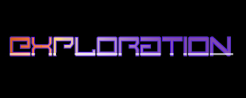
Then I could whip out that special file and present him with something like this…

“Exploration” in Comic Age
Or this…
“Exploration” in Legion
Of course I’d spend a lot more time on a real logo than I did these quickies, but Gene would no doubt be impressed enough to reward me with a red shirt and a one way ticket with the Away Team to Alpha Centuri Seven, or something.
When I teach Graphic Design to young people they always go for either the typeface that has the name that is closest to their own (I suspect it makes the typeface easier to remember) or the typeface that is the wildest, funkiest, and busiest. I try to assure them that if they stick with design they’ll have 4 or 5 decades to explore typefaces, and they don’t need to put every trick into this one pony.
You’ve got to fit the typeface to the project or the only thing you are communicating is that you are a bad communicator.
What message would it have given the reader if I’d ignore the obvious choice for the TUDORs yesterday (Goudy Text MT) and went with something less appropriate…

“Tudor” in Goudy Text MT and GiddyUp. King Henry is NOT amused.
Sometimes when I’m in the processof picking a face I employ the guitar tuning method. I type in the word (as I would pluck the guitar string) and then I try a face I KNOW is wrong (just as I turn the tuning peg on the guitar too far so it is too flat). KNOWING it is JUST TOO WRONG helps me find the true tone (both on the guitar and in Font Book).
Want to “explore” some fun, funky typefaces (aka waste an afternoon)? Visit this site… They have 1,001 “free” fonts.
Related articles
- The Art of Typography (tigerprint.typepad.com)
- Moving Type (dropsomespecs.wordpress.com)
- July Challenge Day 2: TUDOR (ritalovestowrite.com)


July 10th, 2013 at 10:38 pm
[…] July Creative Challenge Day 3: EXPLORATION (ritalovestowrite.com) […]
July 12th, 2013 at 10:34 pm
[…] July Creative Challenge Day 3: EXPLORATION (ritalovestowrite.com) […]
July 19th, 2013 at 7:01 pm
[…] July Creative Challenge Day 3: EXPLORATION (ritalovestowrite.com) […]